Let’s Talk About The Blue Bedroom Fantasy
We’ve all been there.
You’re scrolling Pinterest at 1:47 a.m., and you see it:
- Navy walls.
- Crisp white bedding.
- A chunky knit blanket casually tossed at the foot of the bed like Oh this? I just happen to live in a cozy coastal magazine spread.
And you think: I need that.
But here’s the thing about blue bedrooms:
They can either look like a calming spa retreat…
…or like the set of a low-budget cruise ship commercial.
The difference?
Knowing how to actually make it work in YOUR space.
So grab your coffee or tea, and let’s make your blue bedroom fantasy a reality — without turning your room into a nautical nightmare.
Step 1: Choose Your Blue Wisely
Here’s where people mess up right out of the gate.
They just pick “blue” and run with it.
Bad idea.
Because “blue” is like “pasta” — there’s a LOT of kinds, and they’re not all going to work the same way.
Let’s break it down:
Light Blues
- Fresh. Airy. Beachy.
- Perfect if your room is small and you don’t want it to feel like a cave.
- Looks dreamy with white, beige, and natural wood.
- The risk? Go too light and it can look like a nursery. Unless that’s your vibe, tread carefully.
Medium Blues
- Cozy but not heavy.
- Plays nicely with warm woods, brass, and soft grays.
- Feels more “grown up” than light blue but not as intense as navy.
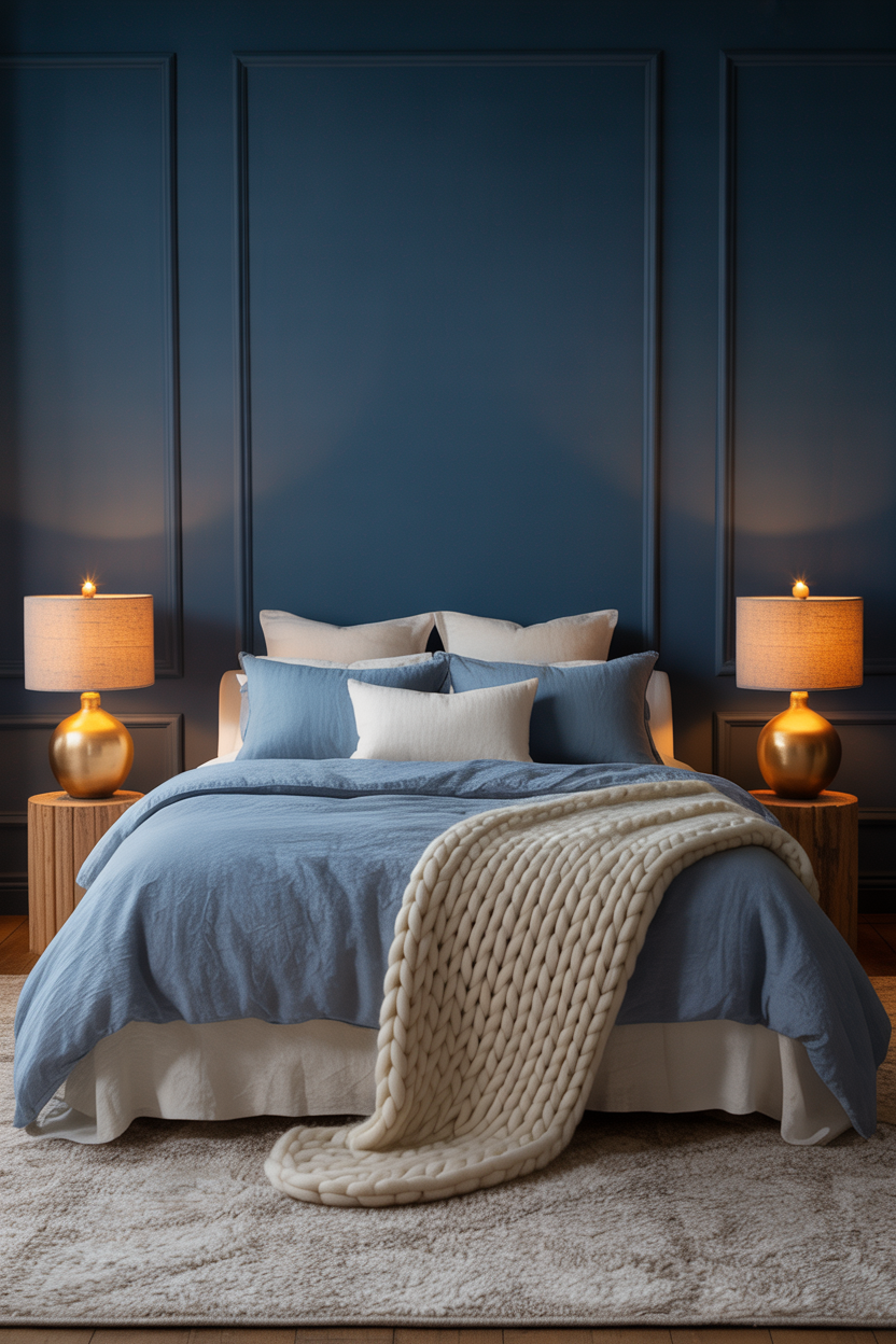
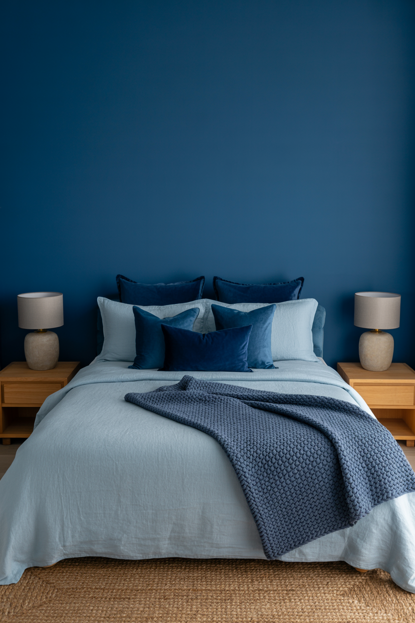
Dark/Navy Blues
- Rich. Dramatic. Moody.
- Works best in rooms with good natural light (or you’ll be living in a cave).
- Gorgeous with crisp white bedding, gold accents, and bold art.
- The risk? Too much navy in a small, poorly lit room = “Why do I feel like Batman?” energy.
The Undertone Situation
Blues aren’t just blues. They’ve got undertones.
- Green undertones = cool, refreshing, slightly coastal.
- Gray undertones = sophisticated, calming, less “hi I’m BLUE.”
- Purple undertones = richer, more jewel-toned, a little glam.
Pro tip: Buy a sample pot. Paint a swatch on the wall. Look at it in morning light, afternoon light, and at night.
If it looks sad and dingy after dark… it’s not “the one.”
Step 2: Pick a Style Before You Start Buying Stuff
This is where the “Blue Bedroom Disaster” happens.
You buy a navy comforter. Then a coastal striped pillow. Then a gold lamp. Then a rustic wood headboard.
And suddenly… your bedroom looks like a yard sale that forgot its theme.
The fix? Pick a vibe before you spend a cent.
Here are a few you can steal:
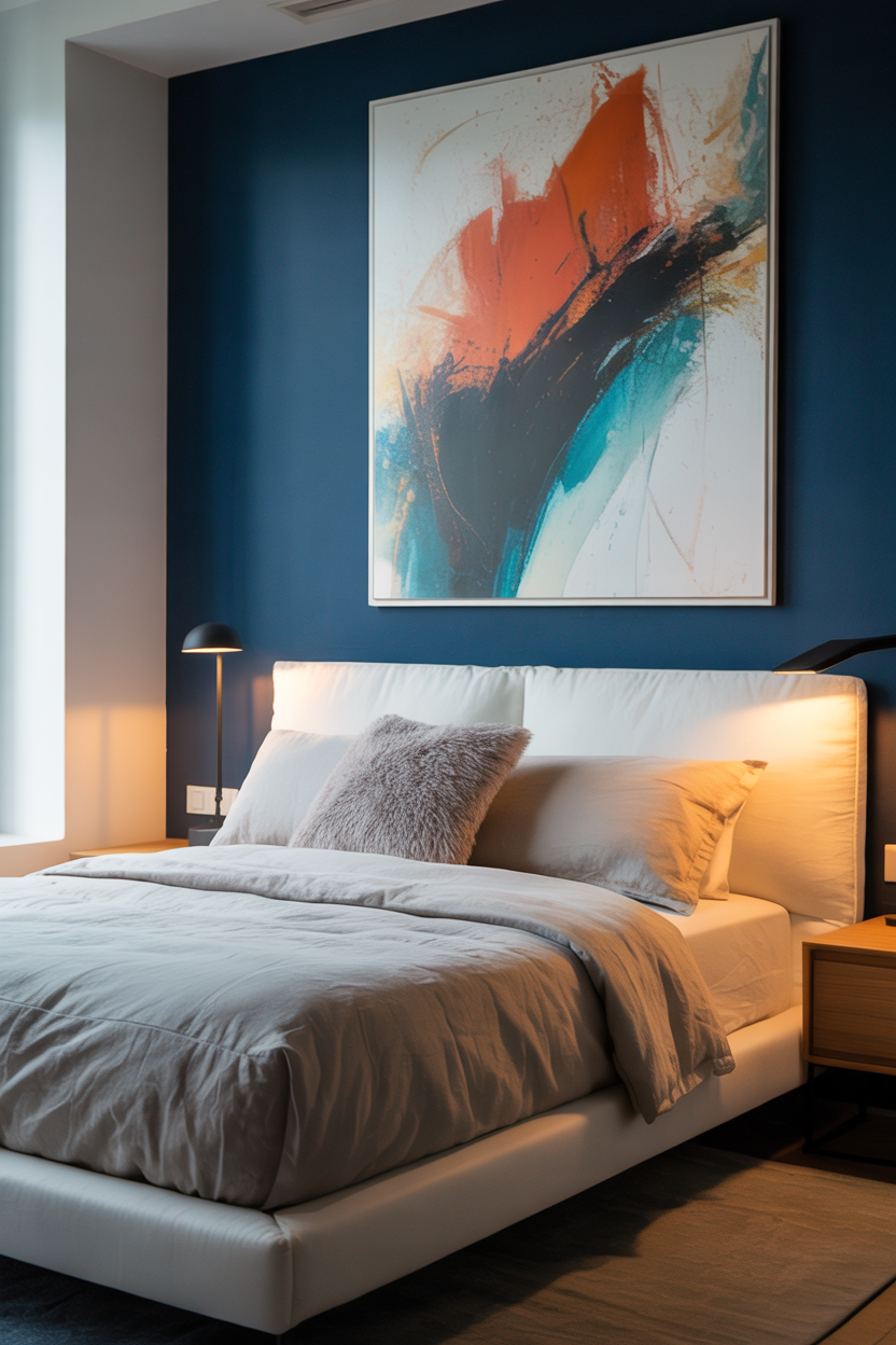
Modern + Blue
- Think: clean lines, minimal clutter, bold art.
- Blue acts as the statement color in a sea of neutrals.
- Example: navy accent wall + white platform bed + matte black lamp.
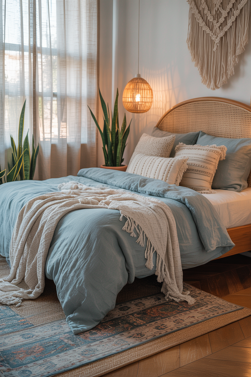
Boho + Blue
- Think: layered textures, woven baskets, patterned rugs.
- Blue is more muted — dusty blue, slate blue, soft teal.
- Example: pale blue bedding + macrame wall hanging + rattan chair.
Coastal + Blue
- Think: light, breezy, Hamptons-on-a-budget.
- Blue is soft, sandy tones and whites.
- Example: powder blue walls + white curtains + driftwood side table.
Traditional + Blue
- Think: symmetry, tufted headboards, rich fabrics.
- Blue is deep, luxurious, and timeless.
- Example: navy velvet bed frame + cream bedding + gold-framed art.
When you know your style before you shop, you save money, avoid mismatched chaos, and actually end up with a room that looks intentional.
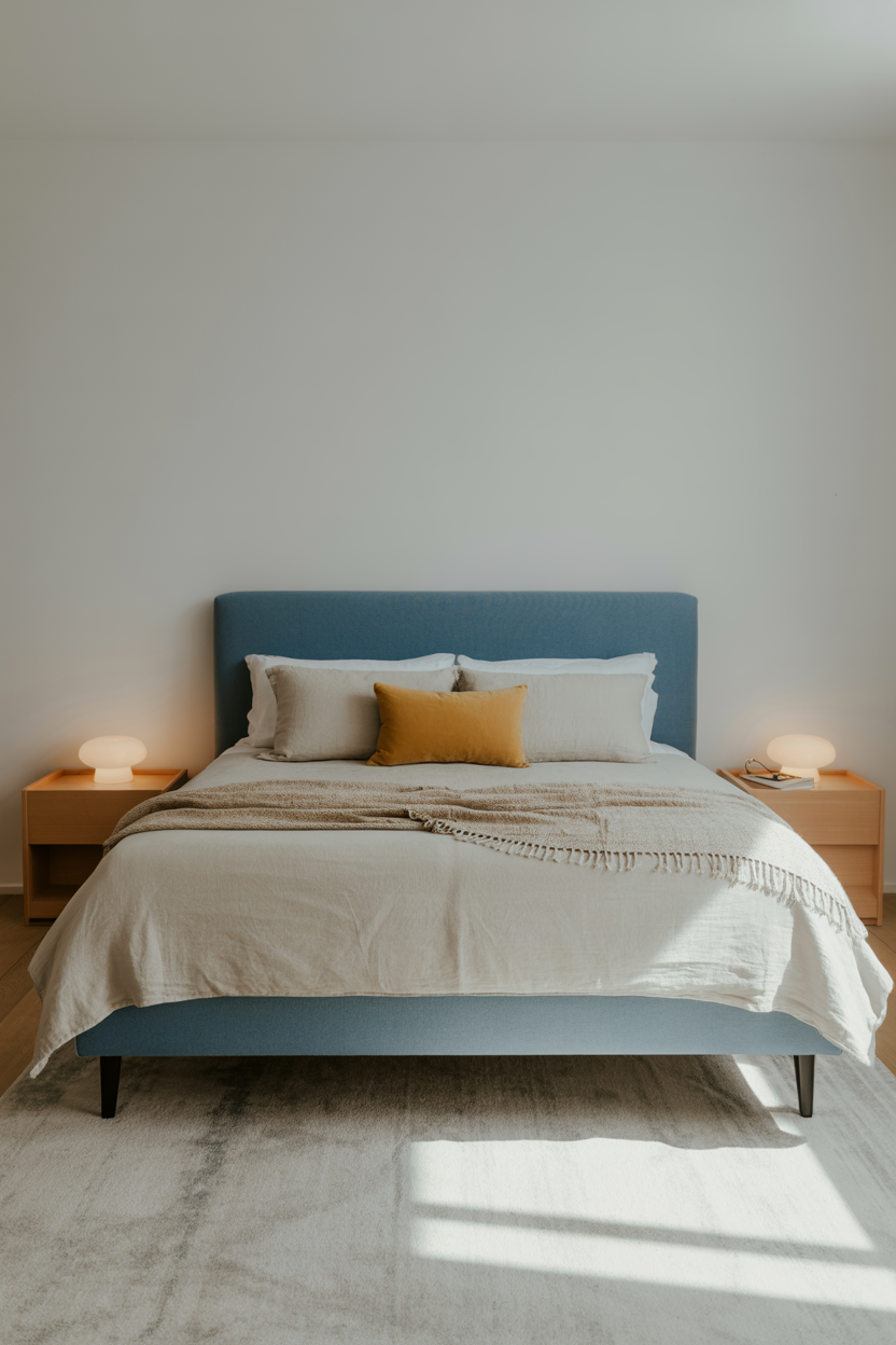
Step 3: Balance Blue with Neutrals (and Maybe One Surprise Color)
Here’s the deal:
An all-blue room sounds like a good idea… until you realize it feels like you’re living inside a blueberry.
You need balance.
The Safe Neutrals for Blue
- Crisp white (clean, fresh, classic)
- Cream (warm, soft, cozy)
- Beige/tan (earthy, grounding)
- Warm gray (cool but not cold)
Pro tip: If your blue is deep, go lighter with your neutrals. If your blue is pale, anchor it with richer tones.
The “Surprise” Color Trick
This is the secret to avoiding “boring but safe.”
Add one accent color that’s unexpected but works:
- Mustard yellow (instant warmth)
- Coral (fun and vibrant)
- Blush pink (soft and romantic)
- Olive green (earthy and calm)
The trick is discipline — keep that accent color to about 10–15% of the room. One throw pillow. A vase. Maybe an art print. That’s it.
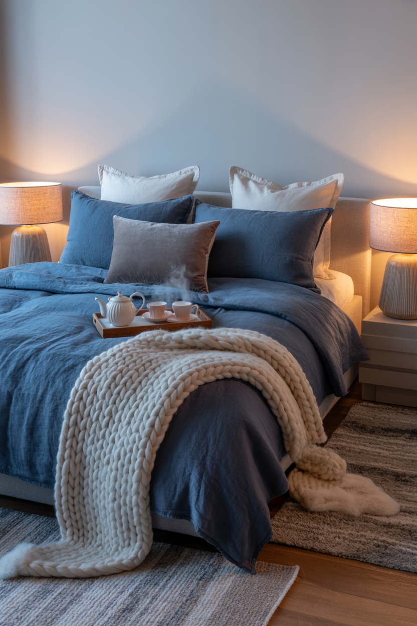
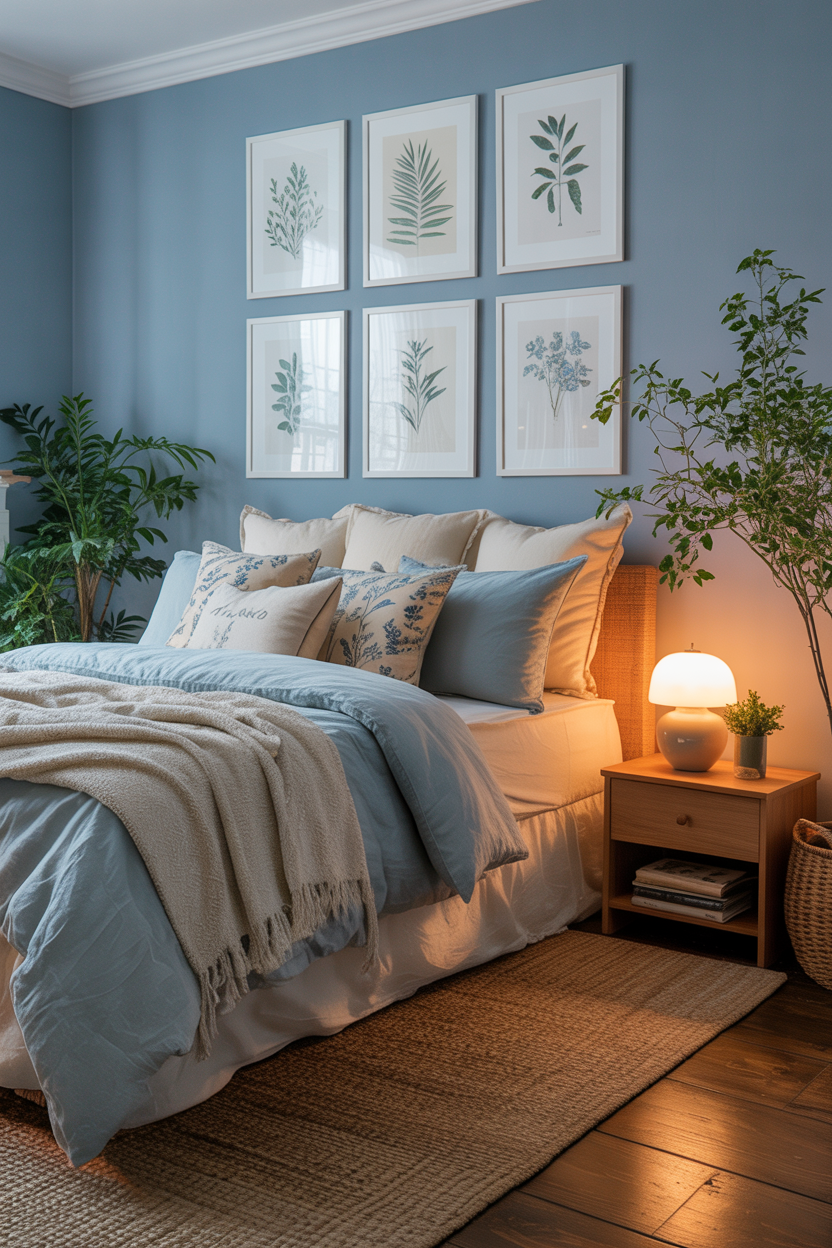
Step 4: Layer Textures so It Doesn’t Feel Flat
Okay, so your color palette is looking good. But here’s the problem:
Color alone won’t make your room feel “designer.”
Texture will.
Think of it like adding toppings to ice cream — sure, vanilla is good… but vanilla + hot fudge + sprinkles? Elite.
Texture Ideas for a Blue Bedroom
- Linen bedding → relaxed and breathable.
- Velvet pillows → rich and cozy.
- Chunky knit throws → instant comfort vibes.
- Woven rugs → warmth and contrast.
- Rattan or cane furniture → keeps things from feeling too “serious.”
Mix Finishes, Too
Don’t just focus on fabrics.
Add shiny and matte finishes:
- Glossy ceramic lamps next to a matte-painted wall.
- Brass drawer pulls on a raw wood nightstand.
These little contrasts keep your space from looking flat or one-dimensional.
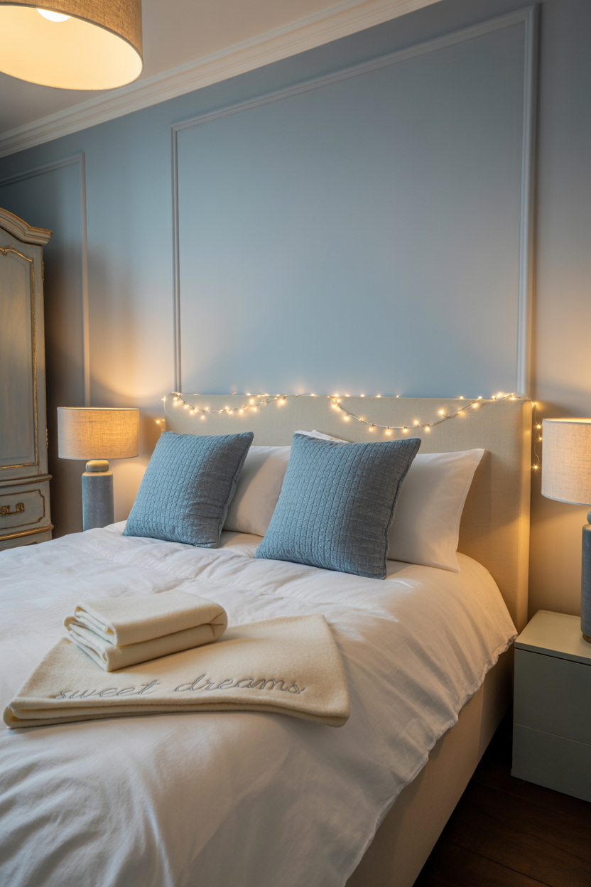
Step 5: Get the Lighting Right
Lighting is like the Instagram filter of your room — it changes EVERYTHING.
Blue is especially tricky because it shifts dramatically depending on the light.
The Warm vs. Cool Light Problem
- Warm light = cozy, inviting, soft.
- Cool light = crisp, bright, but can make blues feel icy.
If you want your blue to feel calming, go for warm bulbs (around 2700K).
If you want it to feel energizing, lean slightly cooler (around 3000–3500K).
Layer Your Lighting
One sad overhead light? Nope.
You need layers:
- Overhead for general lighting.
- Table lamps or sconces for reading.
- Fairy lights or candles for mood.
Dimmers = Your New Best Friend
Want romantic? Dim it.
Want to actually fold laundry and see what you’re doing? Brighten it.
Dimmers give you range, and range is everything.
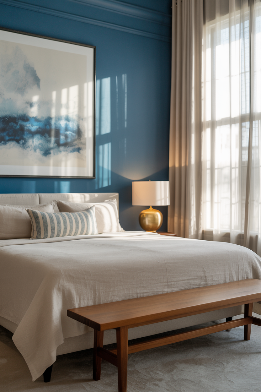
Step 6: Add Art and Decor That Complements (Not Competes)
Let’s have a little heart-to-heart:
If everything in your blue bedroom is… well… blue… you’ve wandered into Blue Overload territory.
The result?
It stops looking chic and starts looking like you own stock in the color blue.
The Goal: Complement, Don’t Compete
- Add art that includes blue but isn’t drowning in it.
- Mix in warmer tones — think gold frames, wooden sculptures, or a pop of coral in your prints.
- Don’t be afraid of negative space. A little breathing room makes your blue pop more.
A Quick Test
Stand in the doorway and squint.
If the whole room blends into one shade, you need more contrast.
Yes, this is a real design trick. Yes, I’m telling you to stand there and squint like you’re suspicious of your own bedroom.
Step 7: Avoid the “Hotel Room” Trap
We all love a crisp, clean hotel bed.
But live in one? No thanks.
Hotel rooms often feel impersonal because they’re designed for everyone.
Your bedroom? That’s your personal headquarters.
Add Personality
- Plants (real or fake, I’m not here to judge your watering skills).
- Quirky decor — maybe it’s a thrift store lamp, maybe it’s a ceramic cat that makes you laugh every morning.
- Books you actually read, not just “pretty” books for display.
- Personal photos in nice frames (bonus points if they match your color scheme).
The Comfort Factor
- Multiple layers of bedding — so it feels inviting, not “military-issue blanket.”
- A mix of pillows in different shapes and sizes.
- A throw blanket that looks like you might actually use it, not one that’s permanently staged.
Step 8: Maintenance & Seasonal Switch-Ups
Here’s the thing:
Even the most gorgeous blue bedroom will eventually feel stale if it never changes.
That doesn’t mean you need a full makeover every season. It means tiny swaps that make it feel fresh without draining your bank account.
Seasonal Switch Ideas
Spring/Summer:
- Lightweight linen bedding in pale blues and whites.
- Fresh flowers (or eucalyptus if you want to feel like a spa).
- Swap heavy rugs for flatweave or jute.
Fall/Winter:
- Chunky knit throws in deep navy or charcoal.
- Velvet cushions for warmth and luxury.
- Layer a fluffy rug over your existing one for that cozy “nest” vibe.
Easy Decor Swaps
- Change your pillow covers — literally the fastest room refresh ever.
- Swap out art prints for seasonal ones.
- Change your lampshade (yes, it makes a difference).
Bonus: The Mini-Decor Audit
Every 3–4 months, stand in your room and ask:
- Is this thing still working with my vision?
- Is it still functional?
- Does it still make me happy?
If the answer is no, it’s time for a swap, sell, or donation run.
Before You Go Painting Your Walls Tonight…
Here’s a quick recap of your Blue Bedroom Survival Guide:
- Choose the right blue (light, medium, dark — test those swatches).
- Pick your style first so your room doesn’t turn into a mismatched thrift store special.
- Balance blue with neutrals (and maybe one surprise color for fun).
- Layer textures so it feels designer, not flat.
- Get the lighting right — warm, layered, and dimmable.
- Choose decor that complements your blue, not competes with it.
- Avoid the hotel trap by adding personality and comfort.
- Switch it up seasonally so it stays fresh.
Final Thoughts
A blue bedroom can be:
- Calming
- Sophisticated
- Totally Pinterest-worthy
…but only if you design it with intention.
Because at the end of the day, the goal isn’t just to make it pretty — it’s to make it yours.
So go ahead:
- Pick your perfect blue.
- Map out your vibe.
- Layer, light, and personalize like the stylish human you are.
And the next time you’re scrolling Pinterest at 1:47 a.m.?
You might just see your own blue bedroom pop up.